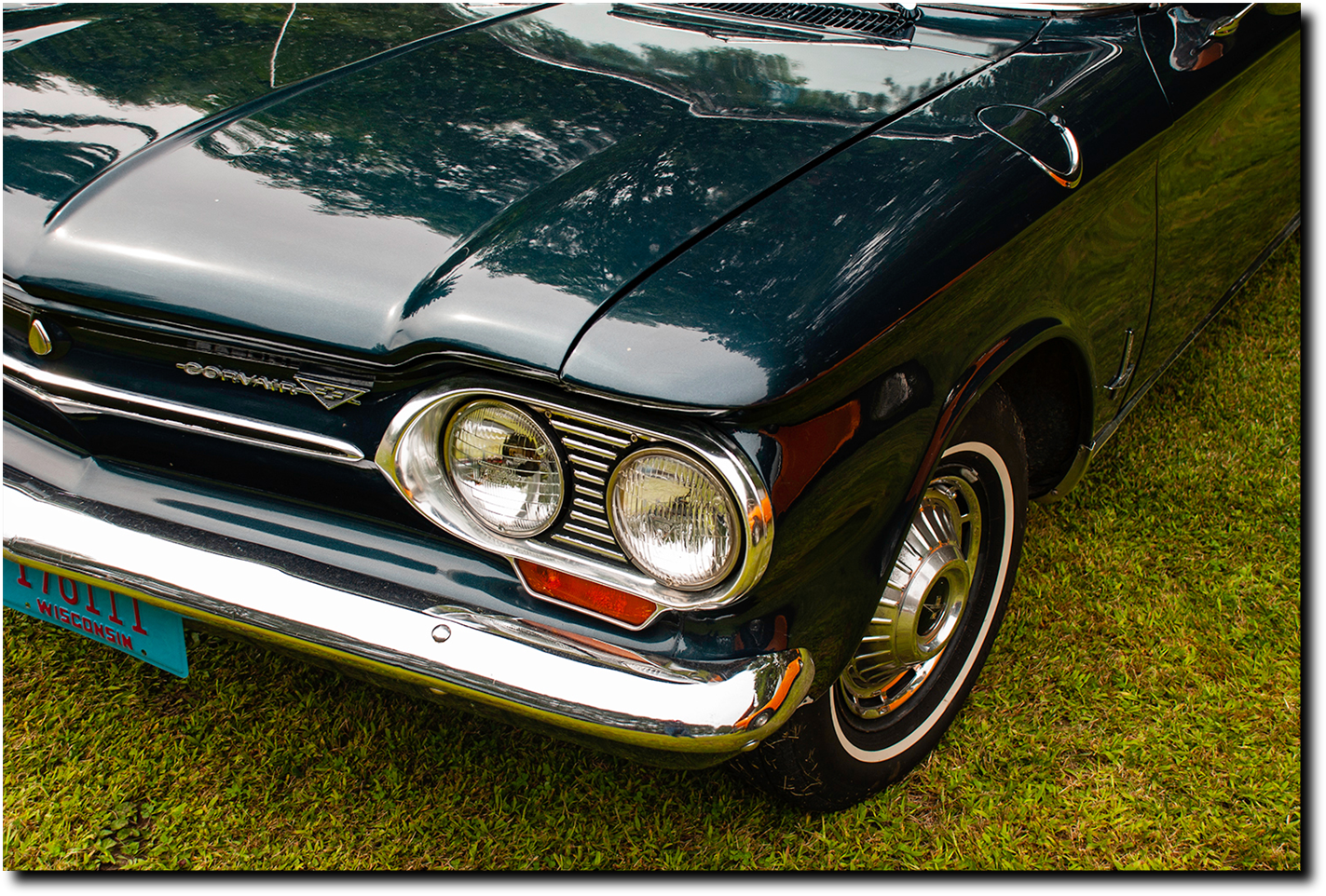


This series one Corvair may seem at this distance of time to be a rather mundane pick. A selection whose time has come in the collector car market perhaps, but a design of another time.
Perhaps it needs to be put in perspective.
There are several elements to the front end design that speak to how radical this drive train was for Chevy and GM to select, engineer and make a significant market commitment in the early sixties, in search of a signature economy car..
One element is the position of the gas cap on the front fender. By its mere position it states that this is something quite different from any front engine car on the road. The half circle around the bottom is a nice touch to highlight the unique character at work.
The next element is the front end with no grille. This is a very contemporary design concern. With the dramatic expansion of electric cars, this is a significant design element of great concern to these new designers. Here we have GM’s design team pioneering an excellent solution. The leading edge of the trunk blending into the arched brows above the twin headlight pods, the brow line crease then turns into the style line running the length of the car. Quite a complex quarter panel body stamping This is all brought together at the front by the forward angled seam below the trunk brow crease, at whose crest we have the horizontal highlight, a chrome and black strip. Dividing, yet uniting, the entire front end, while making it quite subliminally accessible to the buyer at the time. Then on the left we have another superb graphic design, the Corvair logo accenting the horizontal motion the whole, then stamping the attention of the statement with the triangle around the bowtie.
The Corvairs, series one and two, stand out in their solution for the ‘closed’ front design, as does ‘Butzi’ Porsche’s 911. Haven’t seen much to match it yet from the electric ranks looking for identity.


