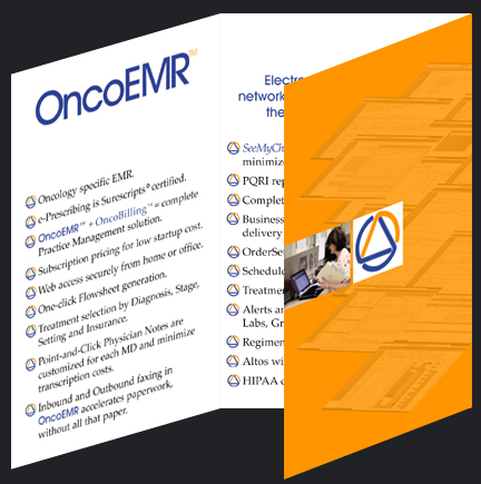

Doctors attending the Clinical Oncology convention are not preteens at the Detroit auto show; they are not going to be carrying bags of media kits to pour over later. The design of the information piece that would serve as the brochure had to be something special, in size and function. It had to tell the corporate story in a manner that was concise, both verbally and visually. The brochure would complete the circle of information being presented at the booth. The Doctors could refer to the brief, but categorical, text while viewing the complex interactive presentation. Thus setting in the mind's eye the full scope of services provided. The brochure was also designed to serve a much more human function, to give the Doctors something with which to keep there hands occupied while standing in front of the 32" flat panels absorbing the complexities of the software. The brochure also had to be most portable, so that it did end up back at the hotel with the doctors, or back at the clinic when he returned. To meet these goals the piece was designed around size. The production size in this case was that of a sport coat breast pocket.
The print work was superbly executed by KK Graphics in San Francisco. They printed it on 115 pound Japenese satin finish stock. A basic three fold, that reenforces the corporate ID, gave the doctors something to fiddle with during the presentation and went home with them in substantial numbers.
There was also a host of traditional branded corporate material, such as business cards, stationary and pre-show post card invitations produced.


The Altos Solution
next
previous


