next
previous
The Altos Solution
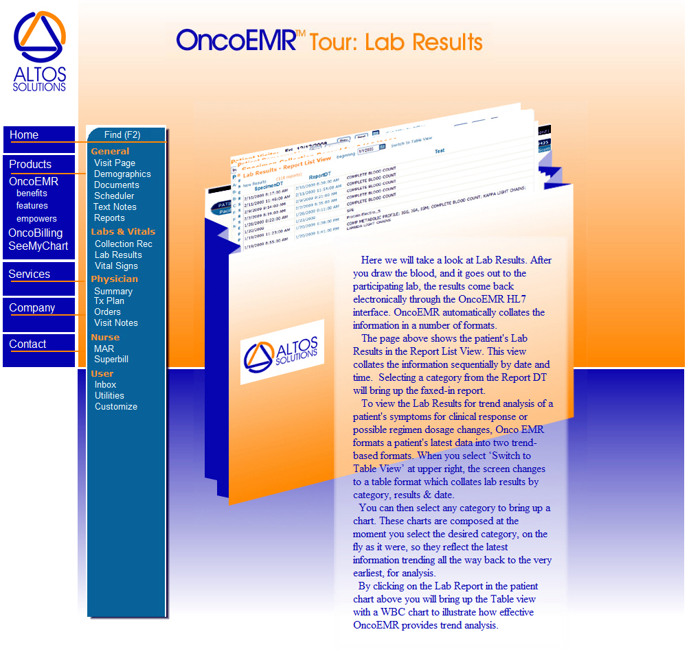
The website was art directed to achieve a number of goals. Primary amung them was to address the time constants of a Medical community in a dramatic procedural transition. Provide information quickly, directly and simply. Design a navigational control system that is equally direct in its simplicity. The page size off 990 X 648 was chosen to make the entire
The Altos Solution
schedule of information completely in sight on the average browser field.
The site was programmed to reflect the immediacy of the software preformance itself.
Graphically the images show the software in operation by the different staff members who will become linked by the system software. Personalizing the often opaque depths of software operation.
The graphic element of the patient chart was chosen to provide immediate insight into the operational capability of the software, and the dramatic procedural benefit of transiting from labor-intensive paper to the performance of immediately available information through a multi-point network.
The colors chosen not only reflect the corporate identity, but also portray the bright and optomistic colors worn by the medical staff in these most dramtic of human settings.


